BECCA ATKINSON
Microsoft
Employee Giving Portal
The Giving Tree is a Microsoft initiative that has helped raise hundreds of thousands of dollars for local non-profits. For over 20 years, Microsoft has given back during the holiday season by placing Giving Trees around campus that employees can “pick a tag” from. When an employee buys a gift, Microsoft matches it dollar for dollar.
The ask was to redesign the current Giving Tree site to serve as a future proof portal that promotes the Giving Tree program and provides employees with the information they need to participate. The site also had to: match Microsoft accessibility guidelines, look and feel like a Microsoft site, and be accessible only by Microsoft employees.
Role and Scope of Project
I served as the main UX designer and content strategist for this project, and worked with a UX lead and then handed off to a copywriter and designer.
As this was a probono project that we were doing for Microsoft, it was crucial that we were lean with our time and efforts. We didn't have time or budget to do a big discovery portion, nor was it as necessary for this project and audience.
Team:
-
UX Lead
-
UX designer/content strategist (me)
-
Copywriter
-
Designer
-
PM & Account team
Site Content + Structure
One of the first things we did as a team was to look at the existing site map (it was huge!) to better understand what content was available and how the pages interacted. We brainstormed what a new site map could look like based on our goal: make the site leaner and easier to navigate in order to encourage program participation. The existing site had a lot of dead links and unhelpful information.

Here is the site map of the site we inherited. There were lots of dead links, repeated pages, and unnecessary pages.

Since it was only a 5-person team, it was extremely collaborative. We white-boarded the new site map as a team.
We decided to limit the navigation items on the new site to reduce cognitive overload and keep it as easy as possible for program participants. We landed on the following pages:
-
Homepage: We wanted to use this page to explain how the program works, and provide all of the most important information.
-
Get Involved: On the old site, there were multiple pages in the top nav that all related to volunteering for the program. We decided to create one page that would house all of the volunteer information, like a one-stop shop.
-
Get Matched: This item linked off to an external site where the participant could get their gift matched dollar-for-dollar. We knew this had to be in the top nav, as this was one of the main reasons users would come to this site.
-
Resources: Looking at all of the pages and pieces of content nested under “Information Hub,” we saw that it was a messy combination of resources needed by program participants AND by program leaders. We decided to keep this page to just resources needed by program participants, and would house information for program leaders elsewhere.
Content Strategy and Wireframing
I took the content audit and mapping we had done as a team and started to lay out each page based on what I thought was priority versus secondary content.
As part of this process, I identified pieces of press I found online that would serve as better pieces of content than their existing “articles.” I thought that having actual press about the program’s success in past years would encourage employees to participate in future years.
I also recommended that we include statistics from last year’s program to further encourage participation. Having key visuals to represent the stats could be a nice addition to the page, and could back up the success of the program.
I also identified areas where we could use icons versus lifestyle imagery to tell an interesting story to the users, instead of just relying on heavy copy.
This was my initial wireframe.

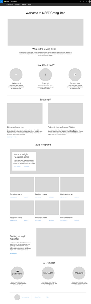
This is what the final design looked like.
Design
Then the project moved into design, where a visual designer worked from my wireframes as a starting point. He introduced color, fonts, and imagery to make everything come to life. This collaboration was one of the most interesting parts of the project, because we worked together to make sure that the layout still made sense when actual copy and images were added.
We ended up making a few key changes to the Homepage layout once we saw how it looked in a final design:
-
Removed unnecessary descriptive copy below the headlines on the homepage
-
Decided we could rely on brief copy to explain the process of selecting and purchasing a gift
-
Introduced a pull-quote right below the list of charities as a selling point for prospective participants.
Outcomes
This is the only project to date (and probably ever) where the scope did not change and we were able to successfully implement everything we recommended. This was in large part because both I and the designer stuck closely to the templates of the site we were designing in, and we didn't recommend anything custom.
Throughout the entirety of this project, we kept the end user in mind. Our primary goal in all of this was to encourage employee participation and make the site a place where employees could learn everything they needed to learn about the program.
One of the best parts of this project was that because of the work we did for Microsoft, our office leadership agreed to let us do our very own Giving Tree at Possible LA. We gave a presentation to our coworkers, set up a whole tree and tag station, and coordinated with office leadership to make a donation to the charity that received the most gifts. It was a huge success!

This is the team that redesigned the Giving Tree site, in front of our very own Giving Tree in the LA office.